One of the things about the Disney Parks that I love are the attraction posters. These were important in the early days of Disneyland, used as a way to promote attractions throughout the park. To this day, there are still attraction posters in the tunnels under the railroad tracks leading to Town Square on Main Street USA. This is my list of favorite attraction posters, and you’ll definitely notice there’s an aethetic that I like. In fact, there’s only one in the entire list that departs from the original 1950s style.
A great place to see many of these posters is in the Pizza Port restaurant in Tomorrowland at Disneyland. It’s actually kind of an ironic decorating choice; what says “tomorrow” better than posters from the 1950s?
Disney has released an incredible coffee table book about attraction posters called Poster Art of the Disney Parks. It’s a large sized book and focuses on presenting the posters in a way that speaks for themselves, rather than a whole lot of text describing the process. Well worth getting.
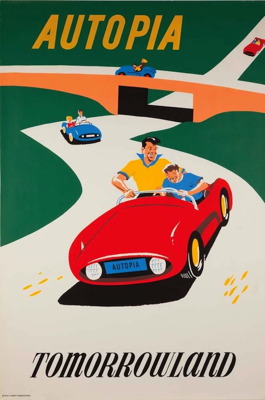
16. Autopia – 1955 (Bjorn Aronson)
The promise of the open road with dad and son. Too bad the actual ride has the car riding on a track so you can’t really steer off the road. The 1950’s design is pronounced in this poster and does set the tone for many future classic posters.
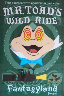
15. Mr. Toad’s Wild Ride – 2008 (Danny Handke)
Several nods to the “cult appeal” of this Fantasyland classic, especially since it was produced so recently. Why are Mr. Toad’s eyes like that? Hmm… There are absolutely no drug references in this poster.
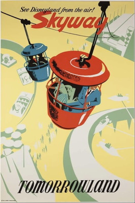
14. Skyway – 1956 (Bjorn Aronson)
If there’s a single ride I could bring back to Disneyland this is it. I love the bucket ride! I want to see Disneyland from the air, too! Sadly, it’s no longer available. But, we do have this great poster from pioneering artist Bjorn Aronson.
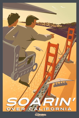
13. Soarin’ Over California – 2010 (Greg Maletic)
The first of the “retro” posters that Disney put together to relaunch Disney California Adventure earlier this year. Â The flat color style fits in fabulously with some of the classic posters from the 1950s. It’s clear Maletic has studied from Disney poster pioneers Aronson and Hartley.
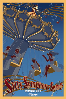
12. Silly Sympony Swings – 2010 (Greg Maletic)
I like the red color on the skin of the riders in this one, which creates a nice contrast with the blue sky and the color of the attraction. Mickey’s treatment is quite nice here, too.
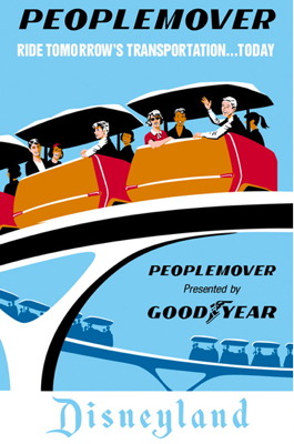
11. People Mover – 1967 (Ken Chapman)
Kudos to Goodyear for sponsoring the centerpiece of 1967’s New Tomorrowland. Of course, there’s nothing “new” about this poster style, which looks like it would fit in place if the attraction launched a decade earlier.
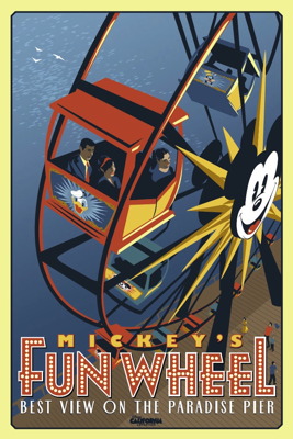
10. Mickey’s Fun Wheel – 2010 (Greg Maletic)
I like how many of the new DCA posters include a tagline. The mimicking of the lights in the letters of FUN WHEEL is also a great design choice.
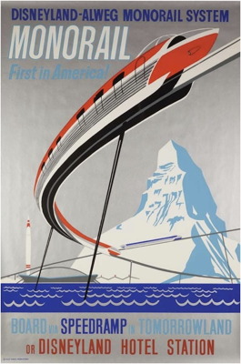
9. Monorail – 1961 (Paul Hartley)
This design was later used at Walt Disney World where they replaced the Matterhorn with the Contemporary Hotel.
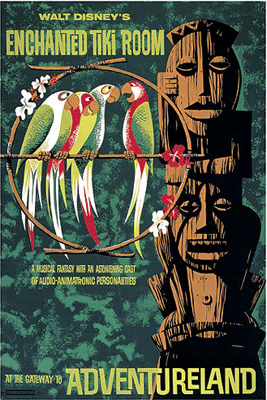
8. Walt Disney’s Enchanted Tiki Room – 1963 (Paul Hartley)
Is the show supposed to be funny or is it maybe a little bit dangerous? This poster perfectly sets up the tension of the attraction.
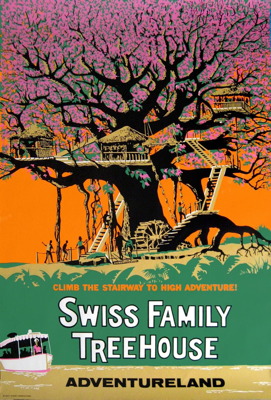
7. Swiss Family Robinson Treehouse – 1962 (Paul Hartley)
Proving I’m not including just my favorite attractions in this list. I never much cared for this attraction, and much prefer the Tarzan’s Treehouse remodel, but this incredible poster simply must be included. Great nod to the Jungle Cruise too.
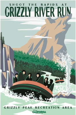
6. Grizzly River Run – 2010 (Greg Maletic)
The saddest part of DCA’s relaunch was a deemphasis of the park’s former icon, Grizzly Peak. Fortunately, this poster restores it’s prominence.
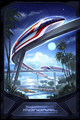
5. Monorail Mark VII – 2008 (Scot Drake)
The only poster with a different design style. Though, at its heart, there’s still a strong sentimental quality to this poster that was created when the very retro designed Mark VII monorail cars debuted. Plus, a nice inclusion of Space Mountain and the Submarine rides, too.
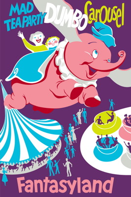
4. Fantasyland / Dumbo – 1955 (Bjorn Aronson)
Strong and robust color choices from this classic. Technically a nod to three attractions, it’s clear Dumbo gets top billing. Pink Elephant… get it?
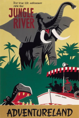
3. Jungle River / Adventureland – 1955 (Bjorn Aronson)
I’m not sure if the Jungle Cruise attraction was ever called the “Jungle River,” but this is a classic nonetheless. Â Spot the kid with the cowboy hat shooting at the hippo.
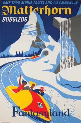
2. Matterhorn Bobsleds – 1959 (Paul Hartley)
Very strong design with 1959’s E-ticket attraction. Bold use of darker colors are a contrast with the more typical pastel colors normally used in the posters. And doesn’t it look like an exciting ride?
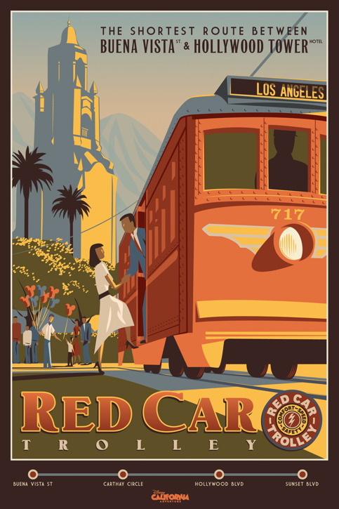
1. Red Car Trolley – 2010 (Greg Maletic)
I simply love this poster, since it tells you everthing you need to know about the new Disney California Adventure. A great sense of nostalgia for the park’s “main street” entrance area, Buena Vista Street. The Red Car Trolley isn’t really a great mode of transportation (you can walk faster than it moves), but the use of this vehicle gives the street a kinetic energy. You could easily see a Disneyland poster that replaces the trolley with a train and the Carthay Circle Theater with a castle.
