Disney is extending the experience for their theme park guests beyond phone reservations and paper park maps. They are moving purposefully this year into their “NextGen” initiative where guests can do a number of things from their smartphones including making meal reservations and managing FastPass reservations.
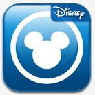
The app that does this (or, soon will…) is called the My Disney Experience. And here’s the iPhone icon for the app.
Anyone else feeling what I’m feeling? Â That this is a really ugly icon.
The Mickey Mouse shape is quite well-chosen, as this design marks the RFID-based keyless entry to the parks and at many attraction entrances. Thus, the phone icon supports the physical locations where guests will leverage this next-generation experiences. But unfortunately that Mickey logo isn’t the only thing on the icon.
Why is there that awkwardly-placed Disney banner on the icon? Who would be confused that this app wasn’t from Disney? Their most famous corporate spokesperson is right on the icon! Who is going to say “where is that Disney app? I see the Mickey Mouse one but where is the Disney one?” Nobody, right? Â You didn’t see Apple put their logo on top of the original “iPod” app on the original iPhone. Why would Disney think that they needed to put their name on icon?
The text-description for the app says “Disney World” so why not leave the Mickey logo alone? Because Disney puts that corporate banner on many of their apps as some sort of consistent branding strategy. This is corporate synergy at it’s worst. That Disney banner is just plain ugly.
