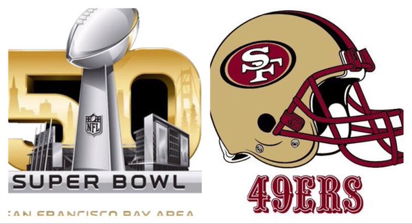
With this year’s milestone Super Bowl being held our own Bay Area backyard, it’s been hard to escape the hype. And thanks to good weather, Julie and I did brave the crowds yesterday to visit Super Bowl City in San Francisco (the fact that we could easily flee and find something else to do in The City was also a factor). Though football isn’t really my thing anymore (thank you SF Giants), it certainly was an impressive scene that many people seemed to be really enjoying.
My initial exposure to SB50’s marketing push came not via television or billboards, but with a display in our neighborhood supermarket. They were selling SB50 logo shirts and other items, obviously trying to position themselves as your “big game headquarters.” But something about the display bothered me. The colors seemed off. I’m used to seeing the NFL’s red/white/blue color scheme but this one seemed muted. What’s with this ugly yellow color?
Oh, it’s supposed to be gold. You know, the “golden anniversary” celebrating the 50th Super Bowl.
I can kind of see it now but I still think the color scheme is all wrong. It’s not a good color, certainly nothing that strikes immediately as gold. The ironic part is that with the game being held in the Bay Area at the SF 49ers home stadium, it isn’t like they don’t have a really good model for what a good gold color should look like on a football logo or jersey. In fact, the Los Angeles Rams’ gold color also matches the 49ers gold.
